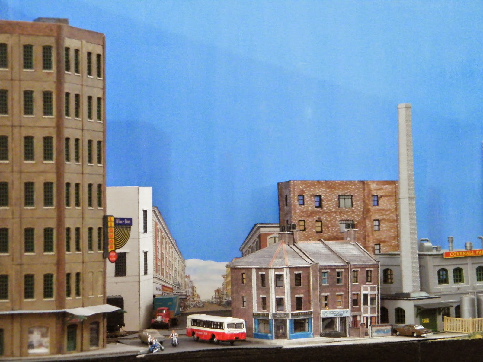
Surprisingly, despite considerable work pressure my layout progress has been more or less steady this year - for the first time in my life (Hope I hadn't jinxed it!).
To give you quick updates, we painted the cold storage building in the mean time, developed additional scenery for the 3D backdrop, completed the entrance of the layout with ground cover etc... and, built the most important thing of all - a couple of cut out bill boards! And guess who owns the clod storage now... yes, frosty it is. :)
So this is my wife's first piece of real estate in the Americas and a decent business venture that too! Ladies and Gentlemen, I present you Frosty's Cold Storage (With a crooked 'L'):
The letters are self adhesive plastic letter cutouts to use on cheap name plates and all - originally had a pathetic golden color. I painted them white, and then put them on the cardboard frame. The one on the rooftop still requires some more bars - I ran out of supply in the process, but managed to complete the basic structure.
Coming to the backscene, though the effect of the 3D back ground photo is awesome from street level, it definitely is strikingly awkward from other angles. Hence I covered both the buildings with a couple of trees in such a way that the effect actually is enhanced from the street level view, but the awkward effect is drastically reduced from other angles. Here are a few shots to demonstrate the cover-up. The first one is from an angle that's never been used before.
More to come... stay tuned. :)


